
Another claim is that the Bush tax cuts lead to an increase in federal revenue. Here's the data. Bush is the first President since Eisenhower to preside over an administration that actually saw a reduction in revenue. The Bush reduction was even greater than Eisenhower, making Bush the worst performer by this measure.
I've made these points before, but what I want to add here is information about how the tax code has become much less progressive over the last few decades for the highest income groups. Looking at my prior link you can see that tax receipts as a % of GDP are not a lot different over the last few decades. On the order of 17 or 18% of GDP typically. While that has remained fairly constant, what's changed is that the burden of those receipts is falling more and more to the poor.
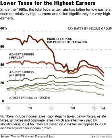
Most people know that the tax rates for the upper income brackets were enormous. The top marginal rate was something like 91% at one point. But what was the effective rate? Tax havens and shelters play a role. How much of a role? Piketty and Saez have the data in detail here. A chart derived from this data is below:
6 comments:
Your two charts don't seem quite consistent; the first one shows the top 1% paying at about twice the rate of the bottom 20%, the second shows them paying at more than three times. Are the definitions or assumptions different?
For the first graph, you don't say either where the data are from or what they show--total federal or total federal+S&L. The text before it suggests federal.
You also don't say how either graph attributes payroll taxes. In theory they are half on employer, half on employee, but that's bogus--both halves are a tax on the transaction of hiring labor. How that divides between after tax wages and cost of labor depends on relative elasticities. The assumption matters because payroll taxes are large and are the one part of the federal system that (if attributed to the employee) is significantly regressive.
"what's changed is that the burden of those receipts is falling more and more to the poor."
That's not what your graphs show. On the contrary--the effective rate on the top 20% trends slightly up, on the bottom 20% trends down, which is the opposite of your claim.
Yes, you are correct. The first chart includes state and local taxes and the second chart is federal only. Here's the source for the first chart. People are often unaware that state taxes are regressive, as I discussed here. That's the reason for the difference between the two charts.
Pikittey and Saez appear to attribute all payroll taxes to the employee. CTJ I believe is tracking the CBO data, and I believe they also attribute all payroll taxes to the employee.
What I meant was that the burden of taxes is falling more and more to the poor with respect to the top 1% and top .01%. You are correct that this is not true with respect to the top 20%.
Thanks for answering my questions. You write:
"What I meant was that the burden of taxes is falling more and more to the poor with respect to the top 1% and top .01%."
But that isn't true. The burden on the poor, according to your graphs, has been going down. The shift shown is away from both the poor and the very top of the distribution, towards not-poor taxpayers in between.
Describing that as the burden falling more and more as the poor is simply false, unless you consider people in the top 20% but below the top 1% to be poor. The burden is falling less and less on the poor.
Or on other words, I have done what your blog title asked me to do--and done it with your data.
You start by writing:
"There are a number of myths that I continuously hear repeatedly on the right. One is that federal taxation is exceptionally progressive."
You then offer what purports to be support for that claim, in the form of a chart showing the effect of federal+state and local taxation, which is irrelevant to a claim about federal taxation.
Your second graph, on the other hand, is of federal tax burden--and shows the highest income group paying at three or four times the rate of the lowest income group, which supports the proposition you claim to be rebutting.
"Describing that as the burden falling more and more as the poor is simply false, unless you consider people in the top 20% but below the top 1% to be poor. The burden is falling less and less on the poor."
You are mistaken. Even if rates went down for all, this wouldn't necessarily mean that the burden isn't shifting to the poor. If the rich see their rates reduce by half but the poor see their rates reduce by a quarter, then the burden is shifting to the poor. The rate for the super rich was cut nearly in half.
Suppose the rich man earns $100 and his tax rate is 70%. The poor man earns $10 and his rate is 15%. Rich pays $70 and poor pays $1.50. Total share paid by the poor is (1.50/71.50) 2.1%.
Cut the rate of rich in half and cut the rate of the poor by one third. Rich now pays $35 and poor pays $1. The share paid by the poor is (1/36) 2.8%. The share of tax burden has shifted to the poor even though the rates for both went down.
"You then offer what purports to be support for that claim, in the form of a chart showing the effect of federal+state and local taxation, which is irrelevant to a claim about federal taxation."
What really is offered in support of that claim is a link that reads "I've shown before that it isn't." That link refers to CBO data that deals exlusively with federal taxes. It also describes the exagerrated claims from the right that I routinely hear and that I am rebutting. In addition to that data related to federal taxes I offered another chart that shows all taxes. I should have made clear that this was all taxes, not just federal.
Lol. Jon. Schooled. But too retarded to give up.
Post a Comment